Dataset Visualizations
Click here for more information
Various visualizations have been created using our database using Tableau and Pandas. Data was scraped/retrieved from SteamSpy and SteamDB. These visualizations were created to explore our data in a way that makes it easy to understand. These visuals compare owners, metascore, game genres, game tags and prices in various charts and visual formats. We are able to add the interactive visualizations directly to this page from Tableau.
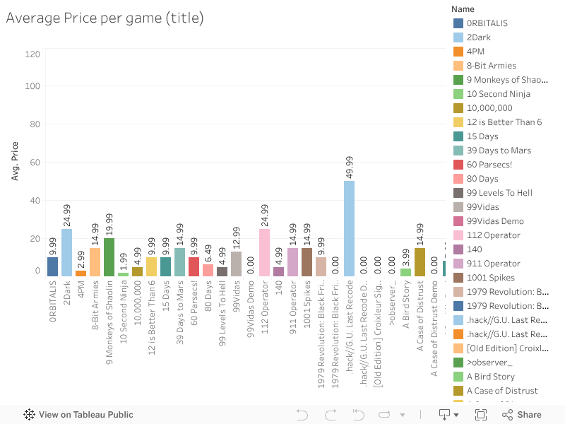
Bar Chart showing the Average Price per Game
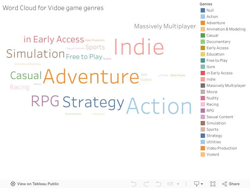
Word cloud showing all genres associated with steam games
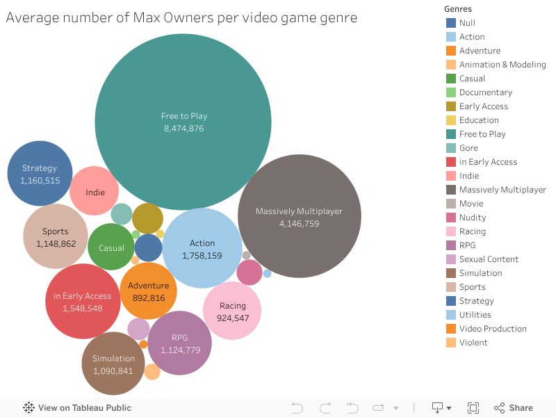
Bubble plot showing owners per game genre.
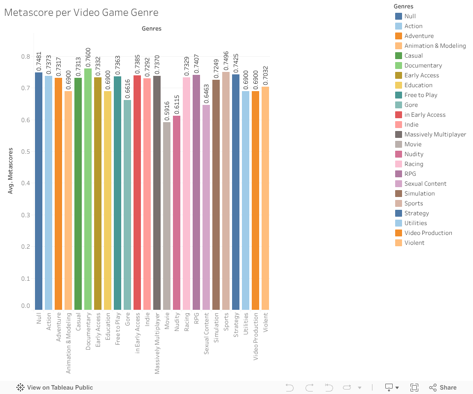
Bar chart showing metascore per video game genre
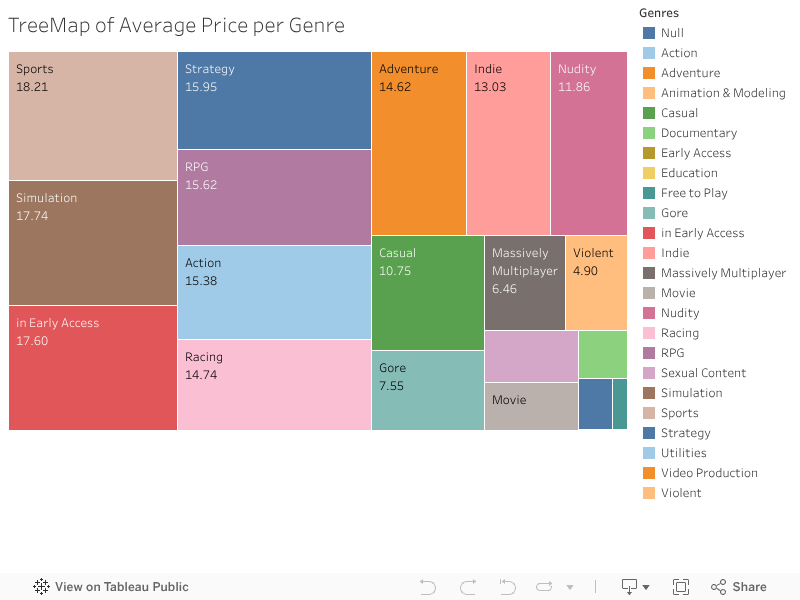
Two visualizations which both show the average game price per genre
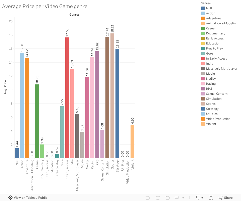
Sports, Simulation and Early Access are the most expensive genres
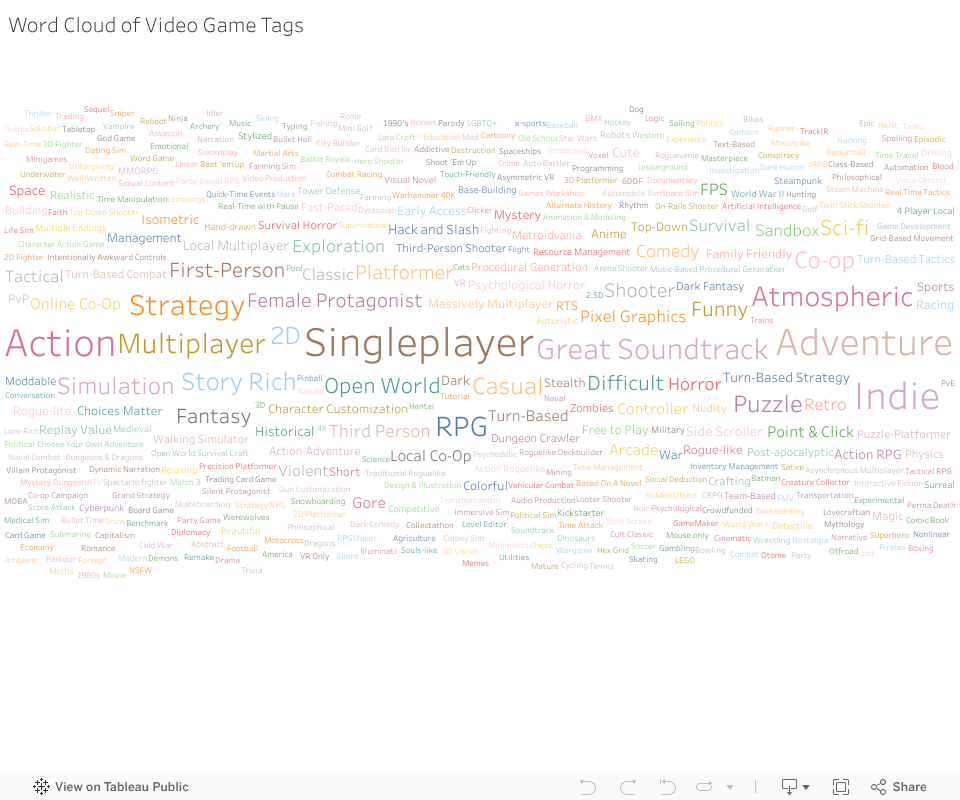
A word cloud showing all the different tags steam games are linked with
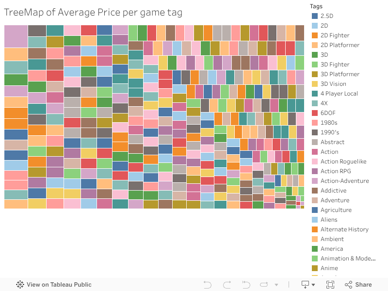
Tree map exploring the average price of a game based on its tags
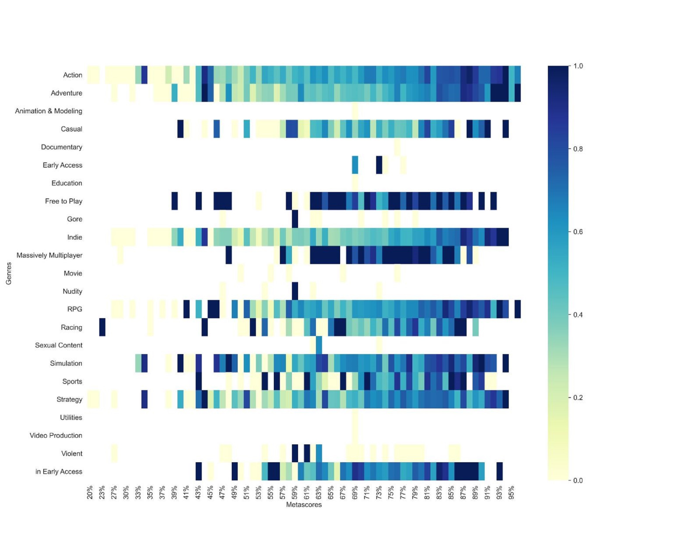
This heat map shows the metascore of specific game genres
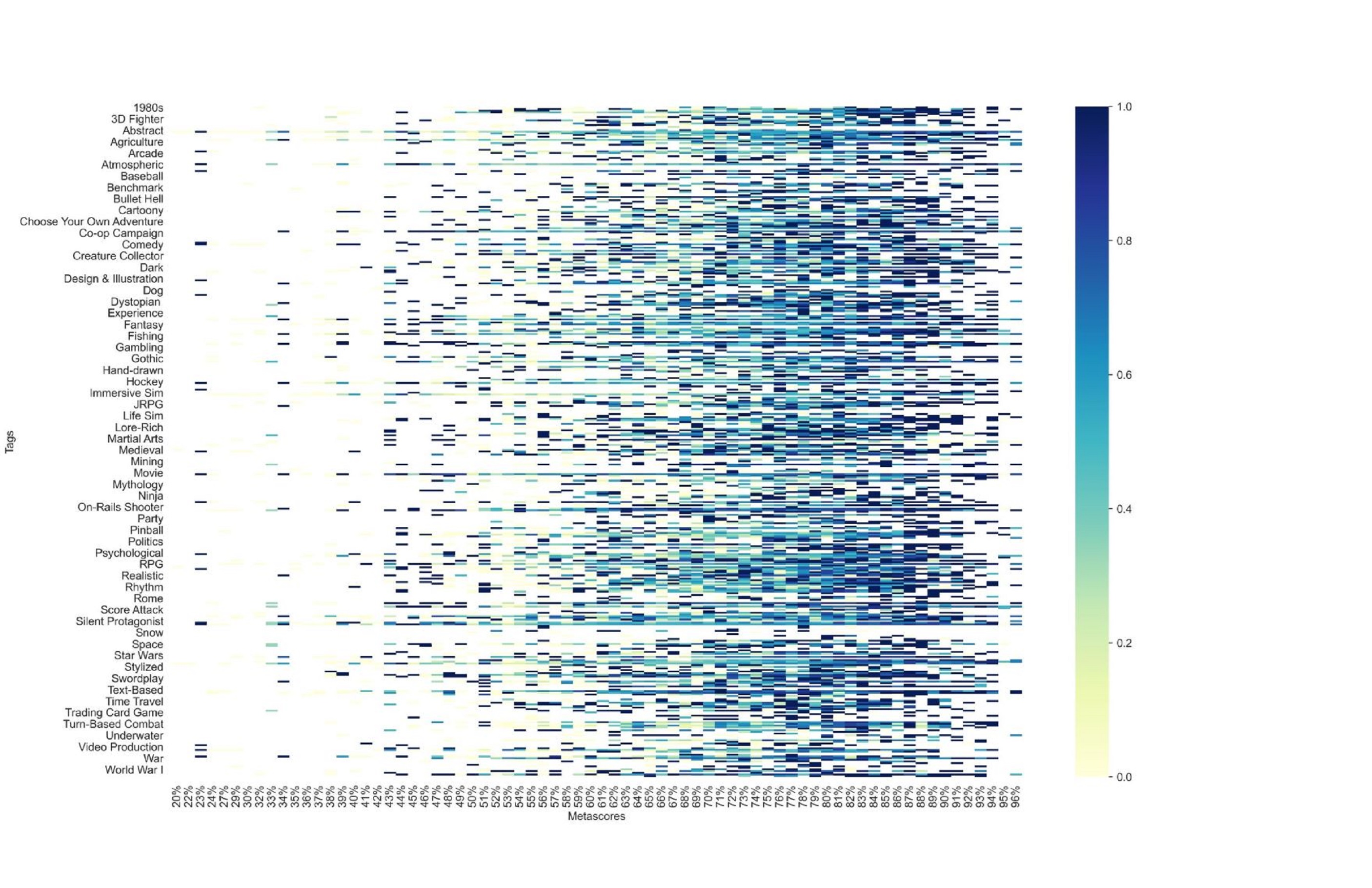
This heat map shows the metascore of specific game tags